Open Self Service Release 1.4.0

We're excited to announce Release 1.4.0 of Open Self Service! This release expands O2S capabilities with new features that enhance both the end-user experience and developer productivity.
On the feature front, we're introducing comprehensive product catalog support that enables rich e-commerce experiences within your self-service portals. We're also adding new summary blocks that provide users with quick insights at a glance, and tile view layouts across all list blocks, giving users flexible ways to view their information.
Let's dive into what's new!
New features
Product Catalog blocks
This update introduces comprehensive product catalog support with three new blocks that enable you to build rich e-commerce and product browsing experiences within your self-service portal.
Product Details block
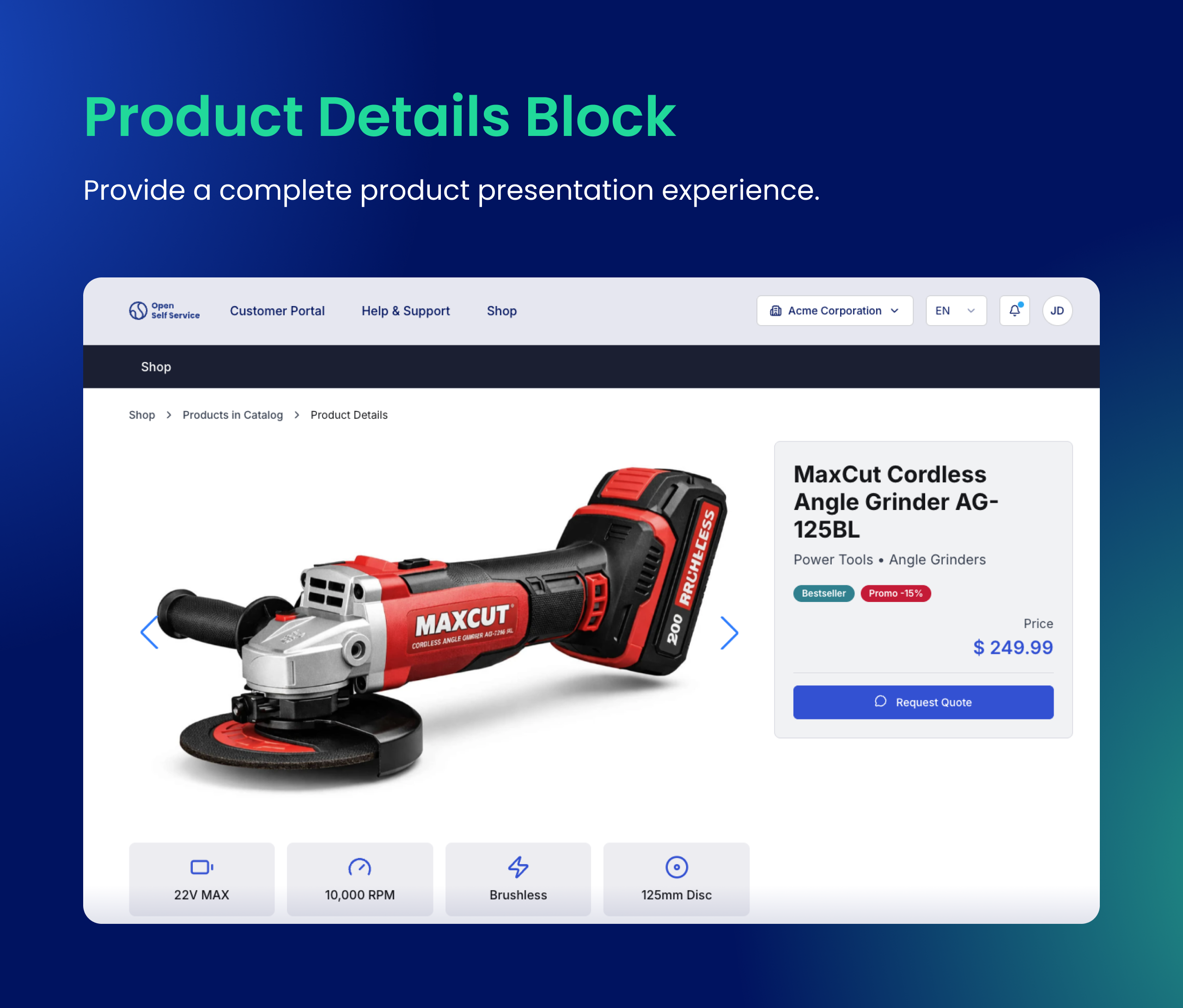
The new @o2s/blocks.product-details block provides a complete product presentation experience:
- Product Gallery with thumbnail navigation and lightbox support for detailed image viewing
- Key specifications displayed in an organized, scannable format
- Product descriptions with rich text support
- Badges for highlighting product attributes like "New", "Sale", or custom labels
- Action buttons for adding to cart, requesting quotes, or custom CTAs
npm install @o2s/blocks.product-details --workspace=@o2s/api-harmonization --workspace=@o2s/frontend
Product List block
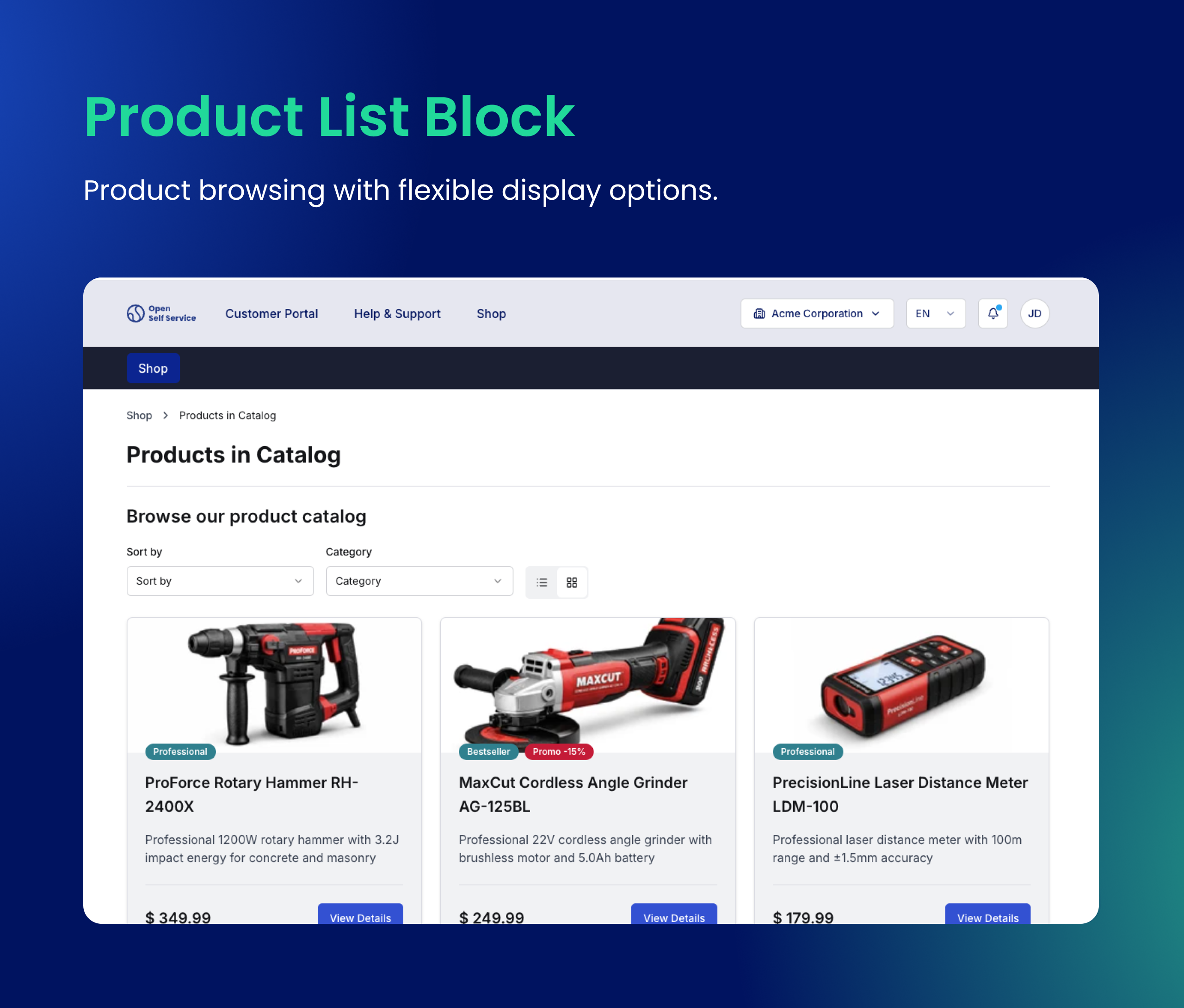
The @o2s/blocks.product-list block enables powerful product browsing with flexible display options:
- Grid and Table views - switch between visual card layouts and detailed table formats
- Product sorting - sort products by name, price, date, or custom attributes
- Filtering support - integrate with the existing filter system for faceted navigation
- Product cards with images, pricing, badges, and quick actions
npm install @o2s/blocks.product-list --workspace=@o2s/api-harmonization --workspace=@o2s/frontend
Recommended Products block
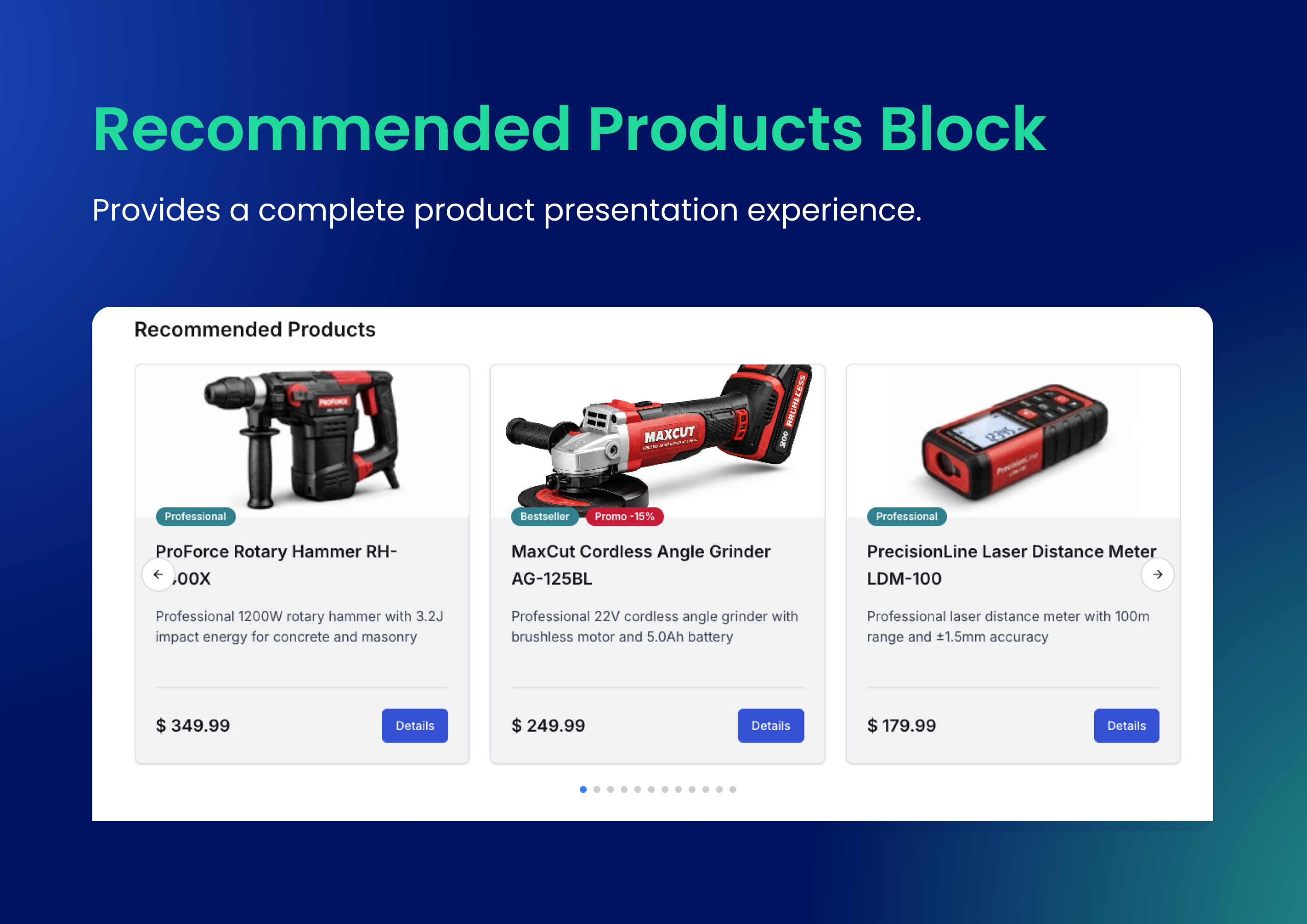
The @o2s/blocks.recommended-products block helps drive cross-selling by showcasing related products:
- Product carousel with smooth scrolling and navigation controls
- Product cards with images, pricing, and badges
- Seamless integration with Product Details pages or any other page layout
npm install @o2s/blocks.recommended-products --workspace=@o2s/api-harmonization --workspace=@o2s/frontend
Currently implemented with mock data, with CMS integrations coming in future releases. See implementation status in Strapi blocks documentation and Contentful blocks documentation.
Content blocks collection
We've migrated a comprehensive set of blocks from our DXP starter, designed for building rich content experiences. These blocks are perfect for marketing pages, landing pages, and content-rich sections of your portal:
- Hero Section - eye-catching hero areas with images, headlines, and call-to-action buttons
- Feature Section - showcase product features with icons, descriptions, and visual layouts
- Feature Section Grid - display multiple features in a responsive grid layout
- CTA Section - compelling call-to-action sections to drive user engagement
- Pricing Section - display pricing plans and comparison tables
- Media Section - embed videos, images, and rich media content
- Bento Grid - modern bento-box style layouts for visual storytelling
- Document List - display downloadable documents and resources
Each block follows the O2S architecture with API harmonization, frontend components, and SDK methods, making them fully customizable and CMS-configurable. You can see all these blocks in action in our Storybook.
This migration is part of our broader strategy to merge O2S and DXP starters into one unified, more powerful and flexible tool that can handle a variety of use cases. Stay tuned for more updates!
Summary blocks
Two new summary blocks provide quick insights directly on dashboard and list pages:
Ticket Summary block
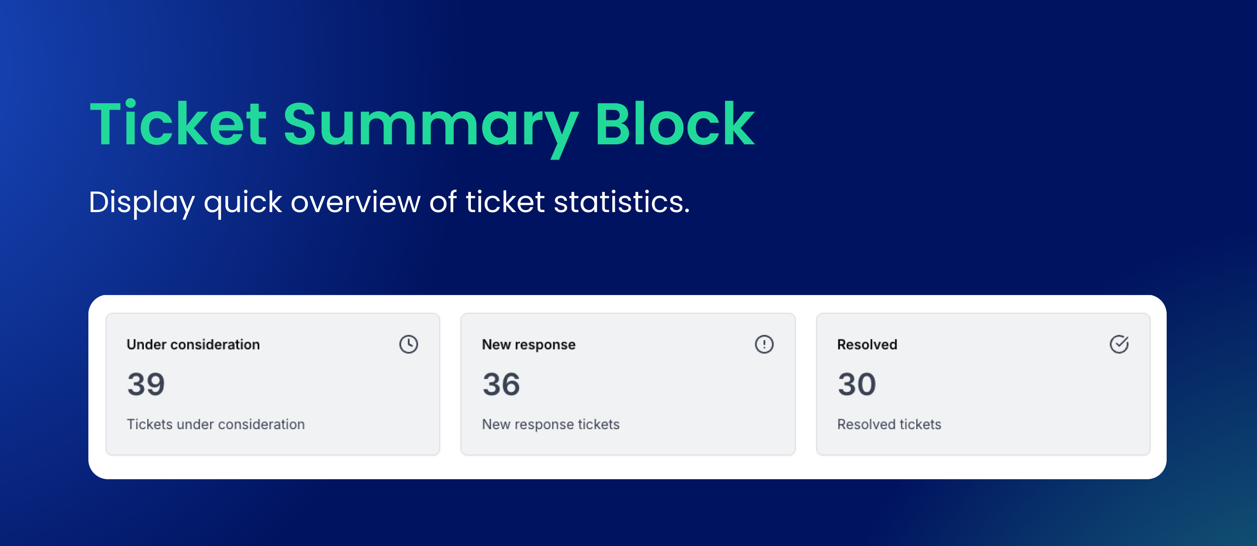
The @o2s/blocks.ticket-summary block displays a quick overview of ticket statistics:
- Total ticket counts by status
- Visual indicators for pending, open, and resolved tickets
- Configurable through CMS for custom layouts
Notification Summary block
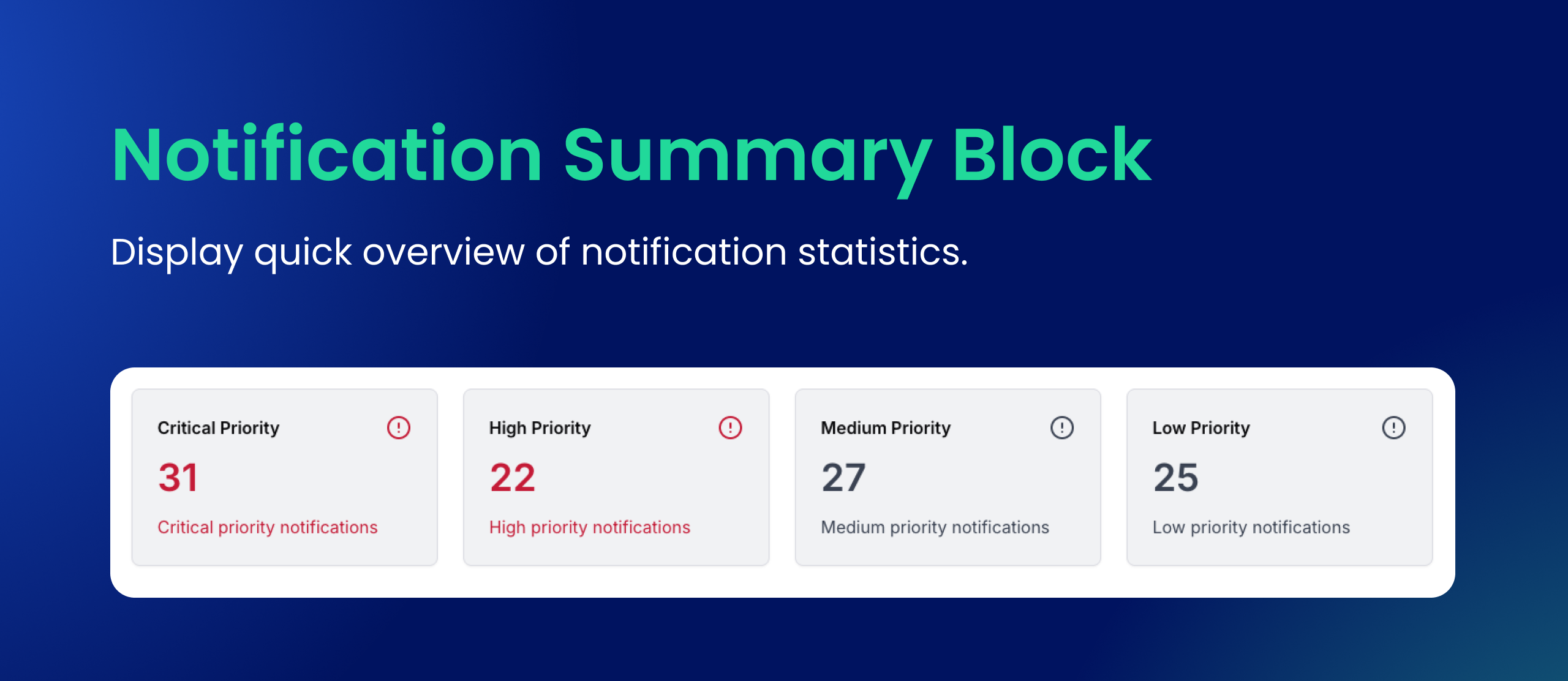
The @o2s/blocks.notification-summary block shows notification statistics at a glance:
- Unread notification counts
- Categorized notification summaries
- Quick access to notification management
Both summary blocks are designed to complement their respective list blocks, providing users with immediate insights without navigating to detail pages.
DataView component with tile layouts
We've introduced a new DataView component that unifies grid and list rendering across data-heavy blocks. This enhancement brings tile (card) view support to:
- Ticket List - view tickets as cards with status indicators and quick actions
- Order List - browse orders in a visual card format
- Invoice List - see invoice summaries at a glance
- Notification List - scan notifications in a scannable tile layout
Users can now toggle between traditional table views and the new tile views based on their preference. The view mode can also be configured via CMS to set default display preferences per page.
Other changes
Storybook migration to Vite
We've migrated Storybook from Webpack to Vite, resulting in faster development experience:
- Faster startup times - Storybook now launches much quicker
- Instant hot module replacement - see changes immediately as you develop
- Improved build performance - faster production builds for the component library
Our public Storybook at https://storybook-o2s.openselfservice.com/ now runs on Vite, providing a snappier experience when browsing components and blocks.
Developer experience improvements
This release includes improvements to the development workflow:
- Next.js 16 upgrade - upgraded to the latest Next.js version with improved performance and new features
- Turbopack FileSystem Cache - enabled Turbopack caching for development, which saves and restores data between builds to greatly speed up subsequent dev sessions
- Optimized dev tasks - reduced CPU and RAM usage during development by limiting Node.js processes and improving task orchestration
- Improved build times - faster incremental builds through better Turborepo configuration
UI component enhancements
We've added and improved several UI components:
- Phone Input - new international phone number input with country code selection and validation
- Inline Filters with expandable sections - filters can now be displayed inline with collapsible sections for better space utilization
- Checkboxes in lists - enhanced list components with selection support for bulk actions
- Improved Breadcrumbs - better navigation breadcrumb rendering and accessibility
- ActionList and MoreActionMenu - enhanced action menus with better UX patterns
- Collapsible component - now supports
defaultOpenprop for controlling initial state
Documentation reorganization
We've reorganized and improved our integration documentation:
- Restructured Strapi, Redis, Medusa, and Algolia documentation for better discoverability
- Updated block documentation with implementation status for Contentful and Strapi
- Added Products module to the normalized data model documentation
- Enhanced theming documentation and starter pages
Bugfixing and security updates
As always, we're committed to maintaining a stable and secure platform. This release includes various bug fixes and security updates including:
- Fixed notification and ticket title rendering with proper links
- Improved filter layout on mobile devices
- Enhanced toggle group component with icon support
- Fixed incorrect price rendering in DataView component
- Resolved ESLint warnings across all blocks
- Updated dependency versions with security patches